I’m glad you asked, because I’ve seen pink and green pairings actually work wonders. Think blush with olive cabinets for a chic texture dance, or mint accents balancing hot pink appliances for a fresh zing. Sage walls soften with blush textiles, while pale pink hardware on olive cabinetry reads luxe. Pistachio counters glow beside rose accents, and seasonal swaps keep things lively. Want more budget-friendly swaps, care tips, and a quick-start plan? There’s plenty more to enjoy ahead.
Pair Blush Pink With Olive Cabinets: Textures That Shine

Blush pink softens olive cabinets in a way that feels effortlessly chic, and the textures do the work to keep things lively.
I pair matte olive with satin blush, then add a woven rug and brass handles to catch light.
You’ll notice depth without shouting color, plus practical warmth that makes daily cooking feel like a stylish, doable ritual. Smart solutions for designing small kitchens can further enhance the functionality of this stunning color combination.
Mint Accents With Hot Pink Appliances: Balancing Heat and Cool

Mint accents dial down the boldness of hot pink appliances without dulling the drama, so your kitchen feels fresh yet confident.
I swap mint for a calm counterpoint, keeping heat where it earns it, not where it yells.
I’d mix matte greens with glossy pinks, add chrome pulls, and let daylight temper the vibe.
Practical, playful balance, zero fluff. Sage green cabinets are gaining popularity in the farmhouse style, offering a trendy yet timeless touch to your kitchen design.
Sage Green Walls and Blush Textiles: Soft, Cohesive Vibes

Sage walls soften the room and give blush textiles room to breathe, so the kitchen feels cohesive without clashing.
I’ll keep it practical: less is more, texture wins, and contrast is optional but smart.
Here are three quick tips you’ll actually use:
- Pair muted greens with warm blush.
- Add tactile fabrics for depth.
- Balance gloss with matte finishes.
Incorporating sage green cabinets can further enhance the natural aesthetic of your kitchen.
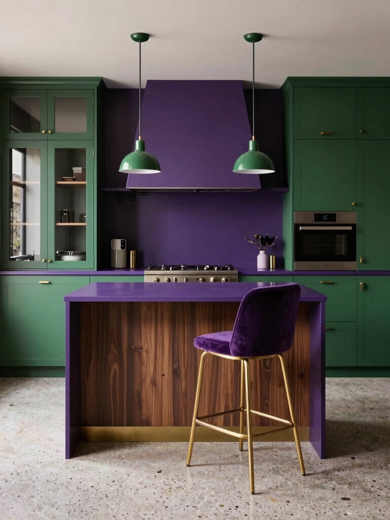
Olive Cabinetry + Pale Pink Hardware: Subtle Luxury

Olive cabinetry brings a calm, earthy backbone to the kitchen, and pairing it with pale pink hardware keeps things feeling luxe without shouting.
I love how the duo reads refined rather than fussy, practical yet pretty. The hardware pops softly, while the cabinets ground every cheerful impulse.
It’s a subtle luxury that doesn’t beg for attention. Quietly elevating, always. Furthermore, the use of green cabinetry can create an atmosphere of unforgettable kitchens that truly stand out in any home.
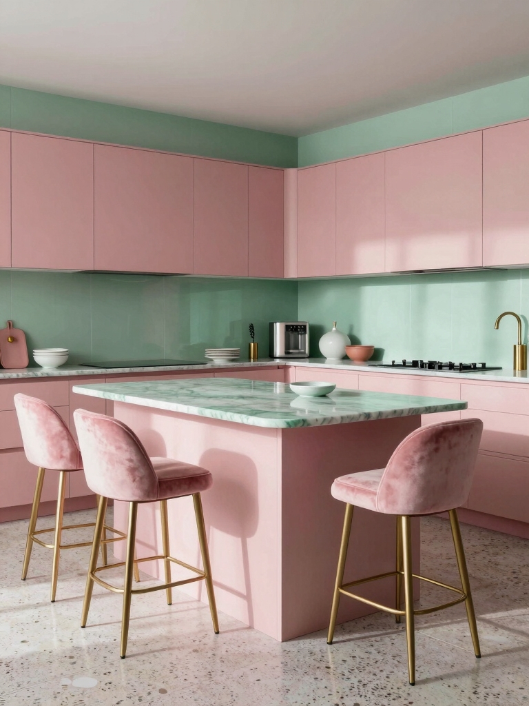
Pistachio Green Countertops and Rose Accents: Pop Without Shout

Pistachio green countertops glow like a subtle encore to olive cabinetry, while rose accents punch up the room without shouting.
I’ll show you practical, sunny ways to pair them without overdoing it.
- Balance with matte neutrals for depth
- Choose rose decor in small, strategic doses
- Keep lighting warm to soften the contrast
- Incorporate moody green interiors to create a harmonious blend that enhances the overall aesthetic.
Eggplant Green Accessories With Mint Backgrounds: Playful Contrast
Eggplant green accessories bring a playful jolt to a minty backdrop, like a wink in a peppermint dream.
I pair these hues for everyday practicality: a toaster, utensil caddy, or rug that anchors light cabinets without shouting.
The contrast keeps surfaces calm yet curious, inviting conversations. Subtle textures, matte finishes, and clean lines sustain the balance. Green kitchen cabinets can instantly refresh your home, creating an inviting atmosphere that enhances this color duo.
Enjoyable, effortless styling, reader.
Blush Pink Lighting Fixtures for Olive Kitchens: Mood and Glow
Blush pink lighting fixtures bring a soft, rosy glow to olive kitchens, and they do more than illuminate—they set the mood.
I’ll keep this practical, conversational, and sharp.
- Offbeat warmth that won’t clash with olive tones
- Adjustable brightness for feast flags and first-dates
- Statement style without shouting, because subtler is chic
White Surfaces With Pink-Green Accents: Timeless Clarity
White surfaces keep things clean and bright, and pink-green accents do the thinking for you.
I love how white keeps countertops calm while those accents spark personality, not noise. You won’t wrestle with clutter; the contrast guides the eye.
Practical tips: keep brushstrokes minimal, balance with a single bold piece, and let pink-green pops stay purposeful, not fussy. Additionally, incorporating smart organization tips can help maximize your kitchen’s functionality and aesthetic.
Matte Finishes: When Pink and Green Mix Becomes Modern
Matte finishes soften the bold pink and green pairing into modern, easygoing chic.
I’ll show you how they work in real life—without gloss, glare, or guesswork.
- Subtle texture adds depth without shouting.
- Smudge-friendly surfaces stay clean-looking longer.
- Color reads sophisticated, not candy-coated.
- The use of rustic charm in kitchen design can enhance the overall aesthetic of these colors.
Natural Materials: Wood Tones That Harmonize Pink-Green
Wood tones ground the pink-green duo without dulling its flare, and that balance starts with choosing the right timber.
I favor light oak for brightness, walnut for grounding, and ash when I need a lift without shouting.
Match grain direction to cabinet lines, seal with matte, easy-care finish, and watch how natural warmth makes pink-green feel inevitable, not gimmicky.
Statistical Guide: Choosing the Right Saturation for Food Photography
Saturation isn’t a guessing game; it’s a tool you can measure and dial in.
I’ll guide you with statistics, not vibes, so your pink-green plates pop without shouting.
- Balance RGB values for natural skin tones and foods
- Test reference swatches under your lighting setup
- Review histograms to avoid clipping and dulls
Practical, witty, and precise for crisp photography.
Lighting Tricks: Making Pink-Green Pairings Look True
Ever notice how pink and green can clash unless the lighting chooses sides?
I’m thinking about Lighting Contrast Play to keep the colors honest, plus Soft Glow Harmony to soften edges without washing out the vibe.
Stick with me as we test tricks that make the palette feel true, not tweaked, so your photos read clean and flavorful.
Lighting Contrast Play
Lighting is the secret spice that makes pink and green feel true, not just trendy, in any kitchen.
I pair contrast to sharpen vibe and guide the eye, not blind it.
Here are quick moves:
- Use cool LEDs against warm pink accents.
- Dim ambers for cozy balance.
- Sunny task lighting to elevate fresh greens.
Soft Glow Harmony
Soft glow isn’t about washing out color; it’s about letting pink and green breathe together.
I tune lighting to nudge warmth without overpowering hue, using dimmable LEDs and a touch of amber near task areas.
I keep shadows soft, highlights honest, and never mute personality.
You’ll see true tones, quicker, happier, and with less eye strain.
Simple, practical, charming.
Seasonal Swaps: Transitional Palettes From Spring to Fall
Seasonal swaps aren’t about reinventing the wheel; they’re about nailing a shift vibe that feels effortless.
I guide you through quick, tasteful changes that keep pink and green intact while nodding to spring then softening for fall.
- Swap airy pastels for richer moss and blush accents
- Layer textiles: linen to wool, flowers to gourds
- Introduce seasonal scents and a charcoal board for contrast
Budget-Friendly Swaps: Affordable Pink-Green Updates
I’m eyeing budget-friendly pink-upgrade ideas and green-accents that still pack personality without blowing the budget.
You’ll see practical swaps that refresh the vibe—think affordable color pops, easy swaps, and rethinking everyday items.
Let’s start with smart, cost-saving tweaks that keep pink and green feeling fresh, not flashy.
Budget-Friendly Pink-Upgrade Ideas
If you’re craving a pink-green upgrade without blowing the budget, start with simple swaps that punch above their weight.
I’m sharing practical, chic ideas you can actually pull off this weekend.
- Peel-and-stick pink backsplash tiles for instant glam
- Budget-friendly pink countertop accessories to spark color
- Repaint cabinet doors in soft rose for a fresh focal point
Green-Accent Cost Savers
Green accents don’t have to bust the budget; with a few smart swaps, you can add personality without the price tag.
I’ll show you practical, wallet-friendly tweaks—think thrifted vases, reusable labels, and bold hardware—that punch up pink-green vibe without pricey renovations.
You’ll gain style, not debt, by choosing durable, easy-care pieces and rotating accents seasonally.
Budget-smart, mood-boosting updates ahead.
Care and Durability: Cleaning Pink and Green Surfaces
Care and durability go hand in hand when you’re cleaning pink and green surfaces, because a little regular upkeep pays off in long-lasting color.
I’ll keep it simple: you clean smart, you preserve shine, you win.
1) Gentle cleaners prevent fading
2) Microfiber mats reduce scratches
3) Quick-dry after spills prevents staining
Quick-Start Checklist: Actionable Steps to Implement
Here’s a quick-start playbook: five practical steps you can tackle this week to implement pink and green surfaces with confidence.
I’ll start simple: pick one focal area, then map color roles.
Next, test swatches in natural light, commit to a brief rhythm, and stock smart basics.
Finally, schedule a quick maintenance routine and celebrate small wins with a pop of contrast.
Ready? Let’s go.
Conclusion
I’m not saying pink and green will solve every home mystery, but give them a try and you’ll see magic happen. Picture olive cabinets meeting blush accents like a chic indie film and a retro toaster cameo. It’s easy, affordable, and surprisingly durable—even grandma would approve. If you’re unsure, start with a small swap, then scale up. And yes, I’ll keep my hoverboard handy for when inspiration strikes in the middle of cleaning. You’ve got this.