

I style kitchen islands like I’m setting a casual stage: start with a layered tray to corral small items, add a sculptural vase or pedestal for vertical drama, and hang a bold pendant to anchor the space.
Mix metals for warmth, lean cookbooks and boards for personality, and keep a bowl of seasonal fruit for color and function. Leave plenty of negative space so each piece breathes — keep going and I’ll show you how to pull each look together.
Layered Trays for Organized Styling

I often start with a simple tray and build up from there, because layered trays let me corral clutter and add personality at once.
I pick a base tray, then nest a smaller, contrasting dish. I add a scented candle, a stack of coasters, and a small bowl for keys or herbs.
The result feels curated, functional, and effortlessly lived-in.
Stylists frequently use layered trays as one of their island centerpiece go-to tricks to make kitchens feel polished without fuss.
Sculptural Vases as Centerpieces

After coralling small items on layered trays, I like to let a sculptural vase take center stage and give the island a bold focal point.
I pick shapes that contrast the countertop, add unexpected texture, and swap stems seasonally to keep things fresh.
- Choose an asymmetrical silhouette
- Play with matte and glossy finishes
- Limit color palette
- Vary stem height
- Leave negative space
Designers often use these island styling tricks to create cohesive looks and elevate casual kitchen arrangements.
Statement Lighting Above the Island
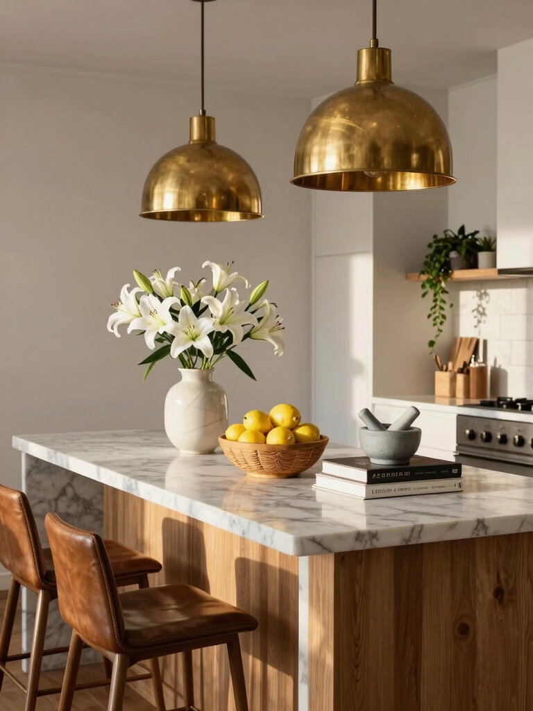
I love using statement lighting above the island because it immediately anchors the room—just make sure the fixture’s scale matches your island so it doesn’t overpower or vanish.
I’ll usually combine a bold pendant with recessed and under-cabinet lights to get that cozy, layered glow for cooking and chatting.
Think of the light as a style focal point that complements your décor while doing real work.
Island lighting often becomes the room’s main character in celebrity kitchens, where designers choose oversized fixtures to create a dramatic focal point and define the space.
Scale to the Space
When I’m sizing statement lights for an island, I start by picturing the island as the room’s headline—too small a fixture gets swallowed, too big one overwhelms.
I balance proportions, sightlines, and function, choosing fixtures that sing without shouting.
Think shape, scale, height, rhythm, and finish to anchor the space like celebrity kitchens do.
- Measure island length
- Consider ceiling height
- Choose proportional width
- Maintain sightlines
- Coordinate finish
Pendant lights over the island create instant drama and draw the eye, making them a go-to in celebrity kitchens and a great way to anchor the space with statement lighting.
Layered Light Sources
Sizing lights to fit the island sets the stage, but now I want to think about how those fixtures work together—layered light makes the island both beautiful and practical.
I mix pendants for drama, recessed downlights for task clarity, and undercabinet strips for soft wash. Dimmers let me shift mood from prep-bright to cocktail-glow, so the island always feels intentional and lively.
Picture-Perfect kitchen island pendants photograph especially well when grouped at varying heights to create depth and visual interest, a technique that highlights photogenic fixtures and makes photos pop.
Style as Focal Point
Bring the eye up and make the island sing — I love using statement lighting as the room’s punctuation mark. It anchors style, sets scale, and adds personality without fuss.
Pick finishes that echo hardware, play with scale, and layer with dimmers for mood. Don’t overcomplicate—let the fixture do the talking.
- Bold shape
- Complementary finish
- Proper scale
- Adjustable dimming
- Textural contrast
Avoid common mistakes like fixtures that are too small, hung at the wrong height, or cause glare; choosing the right pendant size and placement can prevent these kitchen island lighting mistakes.
Curated Cookbook Displays

Cookbooks are part reference, part personality, so I like to treat a small stack on the island like a curated portrait of our kitchen life.
I mix a treasured vintage title with a glossy new release and a compact technique guide, tie them with a ribbon or place a tiny herb clipping on top.
They invite conversation and feel lived-in, not staged.
Fresh Fruit and Vegetable Bowls
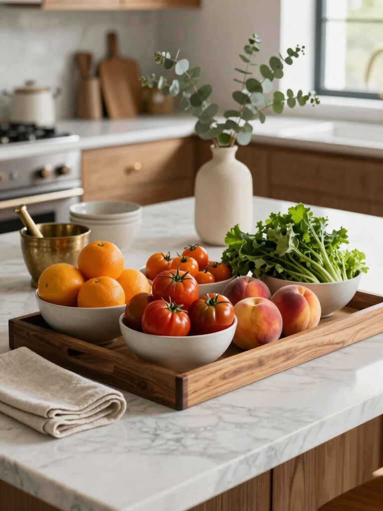
I love using colorful, tiered bowls on the island to keep fruit and veggies both handy and beautiful.
I’ll rotate seasonal produce—bright citrus in winter, stone fruit in summer—to keep the display fresh and relevant.
Mixing textures and heights, like a woven basket beside a ceramic compote, makes the arrangement feel lively and intentional.
Many celebrity kitchens feature show-stopping island centerpieces designed to stop guests mid-conversation.
Colorful, Tiered Bowls
I often style a tiered bowl on the island because it’s an easy, cheerful way to add color and texture while keeping fruit and veggies within reach.
I mix shapes, heights, and hues for a lively, practical centerpiece that invites snacking and compliments the room’s vibe.
- Bright citrus top
- Mid-tier apples and pears
- Hearty root veg base
- Fresh herbs tucked in
- Seasonal accent pieces
Seasonal Produce Displays
Pull together a seasonal produce bowl and you’ll get an instant mood lift for the island—plus a super-useful stash for snacking and cooking.
I choose fruits and veggies that echo the season: rosy apples in fall, citrus in winter, berries in summer.
I mix colors and aromas, rotate items weekly, and keep the bowl accessible so it’s both decorative and inviting—easy to grab, impossible to ignore.
Mix Textures and Heights
When I’m styling a fruit and veg bowl, I think in contrasts—rough skins next to glossy ones, squat pears beside tall bunches of herbs—to give the island an energetic, layered look.
I layer textures and heights for visual rhythm, mixing colors and forms so it feels effortless yet curated.
- Wobbly citrus pile
- Tall herb stems
- Matte avocado trio
- Shiny apples cluster
- Single artichoke focal point
Decorative Cutting Boards Leaning Back
I like to lean a mix of decorative cutting boards against the backsplash—they instantly add height, texture, and a casual, collected vibe to the island without taking up prep space.
I rotate wood, marble, and painted boards for contrast, tuck a small herb pot or citrus bowl nearby, and let edges overlap slightly—effortless, artful, and totally easy to refresh seasonally.
Textured Linens and Placemats
A stack of textured linens and woven placemats instantly softens the island and makes it feel intentionally lived-in.
I layer neutrals with one bold pattern, mix linen and cotton for contrast, and swap placemats seasonally to keep things fresh.
I tuck a napkin under a bowl for casual charm—small touches, big impact.
- Linen napkins
- Woven rattan mats
- Frayed-edge runners
- Neutral stripes
- Soft-muted tones
Potted Herbs for Function and Fragrance
Soft textiles set a cozy scene, and popping a few potted herbs on the island keeps that warmth fragrant and useful.
I tuck basil, mint and rosemary into mismatched pots for color and scent, snip leaves while cooking, and let their shapes add height.
They’re practical, pretty, and instantly livelier than a lone vase—easy green styling that really sings.
Artful Cake Stands and Pedestals
Bring out the cake stand and watch the island transform from prep zone to centerpiece-ready scene.
I arrange pedestals at varying heights, stack vintage plates, and add a single floral sprig. It becomes playful and curated, not fussy.
- Tall marble pedestal
- Gold-rimmed cake stand
- Wooden tiered tray
- Glass cloche on a cake plate
- Ceramic footed dish
Minimalist Dishware Arrangements
I stick to neutral tones only—soft whites, warm beiges, and stone greys—to keep the island calm and cohesive.
I play with layered heights, stacking a couple of plates, propping a bowl, or placing a single cup on a saucer to create a quiet rhythm.
I also leave generous negative space so each piece can breathe and read like a little sculpture.
Neutral Tones Only
When I design a kitchen island with neutral tones only, I focus on a small, deliberate collection of dishware that feels calm but never boring.
I mix textures, matte glazes, and soft shapes to keep things interesting while staying serene.
- Cream stoneware bowls
- Matte white dinner plates
- Sand-colored serving tray
- Taupe ceramic pitcher
- Linen napkins
Layered Heights Play
Sculpting height with a few well-chosen pieces lets me make a minimalist island feel lively without clutter. I stack shallow bowls, prop a sculptural platter, and place a single tall carafe to create rhythm.
Varying heights guide the eye, keep surfaces clean, and invite touch. It’s intentional, playful layering—simple dishware arranged like a tiny, elegant skyline.
Artful Negative Space
Embracing negative space lets me treat the island like a small stage where a few carefully chosen dishes can sing.
I keep things simple: one sculptural bowl, a stack of matte plates, a single mug, a wooden tray, and room to breathe. This restraint highlights texture, color, and purpose without clutter.
- sculptural bowl
- matte plates
- single mug
- wooden tray
- empty space
Seasonal Swaps for Instant Refresh
Because I love small changes that make a big difference, I swap out a few key items on my kitchen island each season to keep the space feeling fresh and purposeful.
I rotate textiles, bowls of seasonal fruit, a sculptural vase, and a scented candle—each shift sets mood, color, and texture. It’s effortless, economical, and instantly uplifting.
Mixing Metals for Visual Interest
I love mixing metals on the island because layered metallic accents add instant depth without feeling fussy. I’ll balance warm brass with cool chrome so the look stays cohesive, not chaotic.
Then I tie those finishes back to fixtures—faucet, cabinet pulls, and lighting—to make everything feel intentional.
Layered Metallic Accents
A few well-chosen metals can lift a kitchen island from functional to fabulously tactile; I like to layer them so each piece plays off the others.
I mix finishes—think aged brass, matte black, warm copper—so reflections and textures flirt without fighting. Small choices make big gestures; I aim for cohesion with a wink.
- Brass pendant lights
- Copper utensil jar
- Black faucet
- Polished-steel tray
- Antique brass knobs
Balance Warm and Cool
When you mix metals, think of it like tuning an outfit—I’ll pair warm tones like brass and copper with cool ones like chrome or brushed nickel so each piece pops without shouting.
I start small—lamp bases, stool legs—then add a bolder accent like a tray. Contrast creates depth; repeat a metal twice to anchor the look and keep it lively, not chaotic.
Tie Finishes to Fixtures
Start by looking up from the countertop and noticing how each finish talks to the space—I’ll match faucet finishes to cabinet pulls and light fixtures so the eye moves smoothly instead of tripping over mismatched details.
I’ll mix metals sparingly, repeat one accent finish, and layer textures for depth.
Try subtle contrasts and a unifying tone.
- Brass accents
- Matte black fixtures
- Polished chrome
- Aged bronze
- Satin nickel
Coffee and Beverage Stations
I love carving out a little corner of the island just for coffee and drinks — it makes mornings feel deliberate and guests feel welcome.
I keep essentials visible: a sleek machine, cups on a tray, sugar and stirrers in pretty jars.
Add a small tray for syrups, a stack of napkins, and a plant for freshness.
It’s practical and inviting.
Personal Objects and Collectibles
After setting up a cheerful coffee corner, I like to sprinkle in personal objects and collectibles that tell a story without cluttering the surface.
I choose a few meaningful pieces—small, varied, intentional—to make the island feel lived-in and curated.
- Vintage salt cellar
- Tiny ceramic animal
- Travel photo in a simple stand
- Brass bottle opener
- Mini succulent in a painted pot
Balanced Negative Space for a Polished Look
While I love filling the island with personality, I also leave breathing room so each object can shine—balanced negative space gives the whole composition a polished, intentional feel.
I arrange clusters with purposeful gaps, mixing heights and textures so the eye rests between pieces.
That pause creates rhythm, highlights favorites, and keeps the surface functional. It’s chic, calm, and surprisingly playful.
I loved wandering through these celebrity-inspired ideas with you, noticing how a layered tray can sit like a tiny island, a sculptural vase rising like a lighthouse, and a bowl of lemons somehow brightening the whole room.
Mix metals, leave breathing space, tuck a favorite book or trinket like a secret, and let a pendant light halo the scene.
Play, edit, and trust that small coincidences—an object, a color, a shadow—will make it feel unmistakably yours.


