
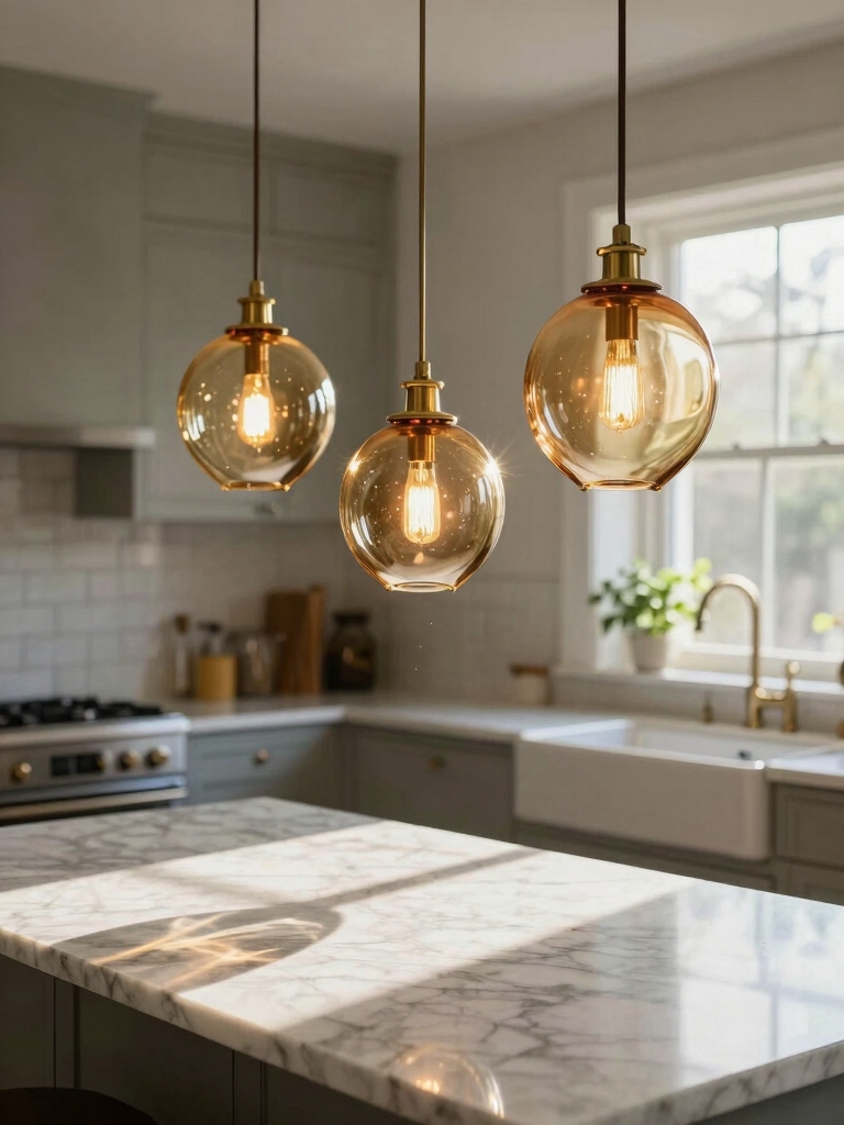
I know which island pendants make photos sing: pick mid-scale sculptural pieces in brushed brass, satin nickel, or frosted glass, space them ~24–30″ apart, and hang about 30–36″ above the counter for balanced framing.
Use warm 2700–3000K frosted LEDs (CRI 90+), soft diffusers or linen shades, and dimmers to sculpt mood. Shoot at f/4–f/8 from slightly below for crisp edges and flattering light, and I’ll show you how to pull it all together.
Choosing the Right Scale for Your Island

When I’m choosing pendants for an island, I start by measuring the island’s length and visualizing the fixtures as a group — a trio for a long island, a pair for something shorter, or a single bold pendant for a compact space.
I balance pendant diameter, drop height, and spacing so photos feel intentional. Scale governs composition; too small disappears, too large overwhelms.
Island lighting can easily steal the spotlight and become the room’s main character.
Warm vs. Cool Light: Finding the Perfect Color Temperature

Scale helps the fixtures read well on camera, but light color defines the mood those fixtures will convey.
I recommend warmer tones (2700–3000K) for cozy, food-friendly shots and cooler temps (3500–4000K) for crisp, modern scenes.
I test bulbs in-situ, balancing ambient daylight and post-edit tweaks so pendants flatter surfaces and overall mood without overpowering the composition.
Designer-look pendants can elevate a kitchen’s aesthetic on camera when chosen for proportion and finish, and many stylish options are available under $200 to achieve that look without breaking the bank.
Diffusers, Shades, and Lenses That Flatter Skin Tones

Because the way a pendant shapes light matters as much as its color temperature, I choose diffusers, shades, and lenses based on how they soften shadows and render skin tones on camera.
I favor subtle diffusion, directional lenses, and warm filters that flatter. My quick checklist:
- Frosted glass for even skin.
- Linen shades to warm tones.
- Low-glare lenses for contrast control.
Avoid these lighting mistakes by planning placement and brightness to prevent glare and uneven illumination, which often occur when designers overlook lighting over the island.
Metallic Finishes That Photograph Without Glare

Although metallic pendants can look dramatic in person, I pick finishes that photograph without glare so faces don’t get lost in bright hotspots.
I favor brushed brass, satin nickel, and lightly antiqued copper—tones that catch light softly and read warm on camera.
I avoid mirror-polished chrome and high-shine gold, choosing subtle reflections that enhance skin tones and scene depth without stealing focus.
Good kitchen island lighting can create a focal point and improve task visibility while elevating the room’s overall style, especially when you consider lighting placement.
Matte and Textured Pendants for Soft, Even Light

I often choose matte or subtly textured pendants when I want lighting that reads soft and even in photos. They diffuse highlights and keep skin tones natural.
I look for finishes that whisper, not shout.
- Soft matte for minimal reflections
- Light texture to break glare discreetly
- Muted tones to maintain color accuracy
Island lighting ideas that go beyond basic pendants often include layered fixtures and unexpected placements to enhance composition and depth, especially when photographing alternative options.
Layering Pendant Light With Ambient and Task Lighting
When I layer pendant lights with ambient and task lighting, I create a balanced look that photographs consistently from every angle.
I mix soft overhead glow with focused under-cabinet or recessed task beams so surfaces read clearly without harsh contrast.
That layered approach gives depth, controls shadows, and keeps the island the star—polished, practical, and camera-ready in any shot.
Kitchens in real remodels often show how thoughtful lighting choices transform the space, especially with stylish lighting accents.
Round, Linear, and Clustered Arrangements That Balance the Frame
If you want a composition that reads perfectly on camera, I arrange pendants in round, linear, or clustered groupings to balance the frame and guide the eye.
I choose scale, spacing, and height to suit the island’s proportions. My go-to setups:
- Round: centered for symmetry
- Linear: rhythmic across length
- Clustered: playful focal point
Photographers often prefer hanging lights that complement the island’s shape and materials.
Bulb Types: LED, Filament, and Vintage-Style Options
After I’ve settled on a round, linear, or clustered arrangement, the bulbs themselves finish the picture—so I pick types that flatter the camera and the room.
I favor warm LED for clean, consistent color; filament LEDs when I want visible glow without heat; and true vintage-style bulbs sparingly for texture and character.
Each choice balances clarity, mood, and photographic appeal.
Dimming and Controls to Capture Different Moods
Because lighting sets the mood, I choose dimming and control options that let me shape scenes from bright, detail-rich prep times to soft, camera-friendly evenings.
I favor simple, reliable systems that photograph consistently:
- Smooth LED-compatible dimmers for flicker-free exposure.
- Tunable white switches to match color temp to scene.
- Smart presets for repeatable, camera-ready moods.
Placement Height and Spacing for Camera-Friendly Shadows
I’ll start by suggesting the sweet spot for pendant height—usually 30 to 36 inches above the counter—to keep faces lit and reflections minimal.
Then we’ll talk spacing: even intervals (about 24 to 30 inches center-to-center) create balanced shadows and consistent light across the island.
Stick with these guidelines and your photos will show clean, flattering shadow lines instead of blotchy dark spots.
Ideal Pendant Height
When I hang pendants for a kitchen island, I aim for a balance that flatters food, faces, and photos: typically 30–34 inches above the countertop for single fixtures and about 28–30 inches when a cluster sits over a lower-profile surface. I tweak height for mood and shadow:
- Test with bowls and plates.
- Photograph from standing height.
- Lower slightly for intimate task light.
Balanced Spacing Intervals
A good rule of thumb I follow for balanced spacing is to treat each pendant as a light and a lens—positioning them so their beams overlap just enough to avoid harsh gaps but not so much that shadows flatten the scene.
I space fixtures by considering island length, camera angles, and beam spread, then tweak heights slightly to sculpt soft, directional shadows that flatter countertops and food.
Styling Around Pendants: Backsplash, Countertops, and Props
I like to start by coordinating the pendant finish with my backsplash and countertop tones so the whole composition feels intentional on camera.
Then I layer in textured props—wood cutting boards, woven placemats, and a single ceramic vase—to add depth without clutter.
Those simple choices keep the focus on the pendants while giving photos a warm, curated look.
Coordinate Finishes and Tones
Because lighting sets the mood, I match pendant finishes and tones to the surrounding surfaces so photos read as intentional, not accidental.
I balance metal, wood, and stone cues for cohesive frames. My quick checklist:
- Echo chrome or brass in hardware for unity.
- Tie pendant warmth to countertop undertones.
- Use backsplash color to anchor contrast.
The result feels curated and calm.
Layer With Texture Props
Layering texture around pendants brings photos to life, so I combine rough and smooth surfaces to create depth without clutter.
I place matte stone trays, woven baskets, and glossy ceramics near the pendants, varying heights and scales for contrast. Fresh herbs or folded linens add softness.
I keep palettes restrained so textures sing, not compete, letting pendants remain the star in each shot.
Photographing Pendants: Camera Settings and Angles
When I photograph pendants, I focus on camera settings and angles that highlight their shape, texture, and how they sit in the kitchen space.
I tweak exposure and aperture for crisp edges, then move to find the most flattering perspective.
- Use f/4–f/8 for depth.
- Shoot slightly below for drama.
- Include negative space for scale.
Maintaining Color Accuracy in Post-Processing
I dial in color accuracy in post so the pendants look the same on screen as they did in the kitchen.
I use raw files, tethered previews, and a calibrated monitor, nudging white balance and HSL selectively to preserve metal tones and glass highlights.
I sample neutral areas, apply gentle profile corrections, and keep edits consistent across the series for reliable, true-to-life results.
Budget-Friendly Picks That Look Luxurious on Camera
I’ve learned you don’t need designer budgets to get pendants that read luxe on camera. I look for warm metallic finishes, soft-glow diffused bulbs, and sizes that’re scaled to the island so photos feel intentional.
In the next section I’ll show affordable options that hit those marks and photograph like a million bucks.
Warm Metallic Finishes
Because warm metals catch light so well, I often reach for brass, bronze, and aged gold finishes when I want pendants that read expensive on camera without emptying my wallet.
I favor pieces with subtle patina, matte highlights, and clean silhouettes. Consider:
- Polished brass for warmth
- Aged bronze for depth
- Brushed gold for understated glam
Diffused Soft-Glow Bulbs
Often I reach for diffused soft-glow bulbs when I want a kitchen island to look rich on camera without spending much, because they instantly soften shadows and warm skin tones.
I choose frosted LED bulbs with CRI 90+, warm 2700K light, and moderate lumen output to avoid glare.
They photograph beautifully, flatter faces, and make pendant fixtures feel high-end without a high price.
Scaled-For-Photo Composition
Think about scale before you buy: I size pendants not just to the island’s length but to how they’ll read in photos, where proportion makes or breaks the shot. I lean toward budget-friendly fixtures that feel luxe on camera.
Quick rules I follow:
- Single large pendant for shallow islands.
- Cluster three for longer runs.
- Keep visual weight mid-tone to avoid glare.
Statement Pendants That Double as Functional Art
I love when a pendant pulls double duty — not just lighting the island but acting like a centerpiece you’d hang in a gallery.
I pick pieces with intentional silhouettes, tactile finishes and surprising details that read well on camera.
They anchor composition, spark conversation and deliver usable light. Choose sculptural forms that flatter angles, avoid visual clutter, and photograph like deliberate art, not afterthoughts.
I’m borderline obsessed with kitchen island pendants now — they’re tiny mood machines that can make your whole room sing (or sulk).
Pick the right scale, color temp, finish and diffuser, and suddenly every dish, face and moment looks like a magazine shoot.
You don’t need to break the bank to get that cinematic glow; a curated, thoughtful pendant feels like wearable art for your kitchen — irresistible, practical, and utterly photographable.


