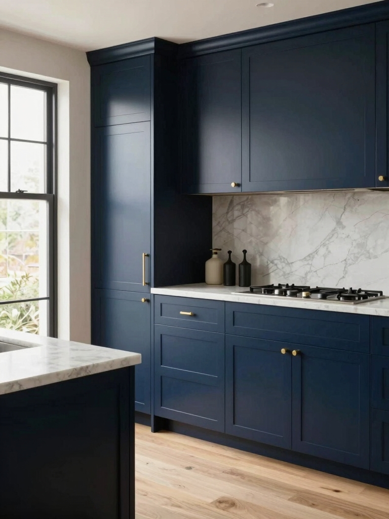
I often use navy cabinets to anchor dull layouts because they add instant depth and a pattern-ready backdrop that makes every element feel intentional. Navy frames open shelving, hides wear, and pairs beautifully with warm woods, crisp marble, or brass hardware for layered contrast.
I choose finishes and lighting to keep the space cozy, not cave-like, and I test samples under real light before committing. Keep going and I’ll show you the exact pairings, finishes, and styling tricks that work.
Why Navy Works in Kitchens

Because navy balances depth and neutrality, I’m drawn to it as a kitchen color that feels both grounded and surprisingly flexible.
I use navy to anchor islands, frame open shelving, and layer textures—matte cabinets, glossy backsplashes, brass hardware.
It reads modern yet timeless, hides wear, and pairs with warm woods or crisp white.
Navy creates pattern-ready backdrops that make kitchens feel intentional.
Navy blue kitchens are especially effective when paired with deep navy cabinets to make a bold, cohesive statement.
Choosing the Right Shade of Navy
When I choose a navy for cabinets, I think about whether a warm or cool tone will set the mood I want and how that tone plays with light in the room.
I check the paint’s Light Reflectance Value so I know if the color will read deep and cozy or more muted in low light.
I also consider which metals—brass for warmth, chrome for contrast—will bring out the best in the shade.
Dark blue cabinets have helped make moody, modern spaces feel mainstream while adding depth to kitchens.
Warm vs. Cool Tones
If you want navy cabinets that feel cozy and inviting, I lean toward warm navy shades with subtle brown or teal undertones; for a crisper, more modern look I choose cool navies with blue-gray or indigo pulls.
I suggest pairing warm tones with brass hardware and natural wood, and cool tones with chrome, marble, or geometric backsplash patterns to reinforce the chosen mood.
Designers often recommend testing paint samples in different lighting to see true color variations, especially when combining cabinets with other finishes like cabinet color pairings.
Light Reflectance Value
As I pick a navy for cabinets, I pay close attention to its Light Reflectance Value (LRV) because that single number tells me how much light the color will return to a room; a navy with a low LRV will read nearly black in dim spaces, while a slightly higher LRV keeps depth without swallowing light.
I test swatches in patterns of light, noting how grain and trim alter perceived brightness.
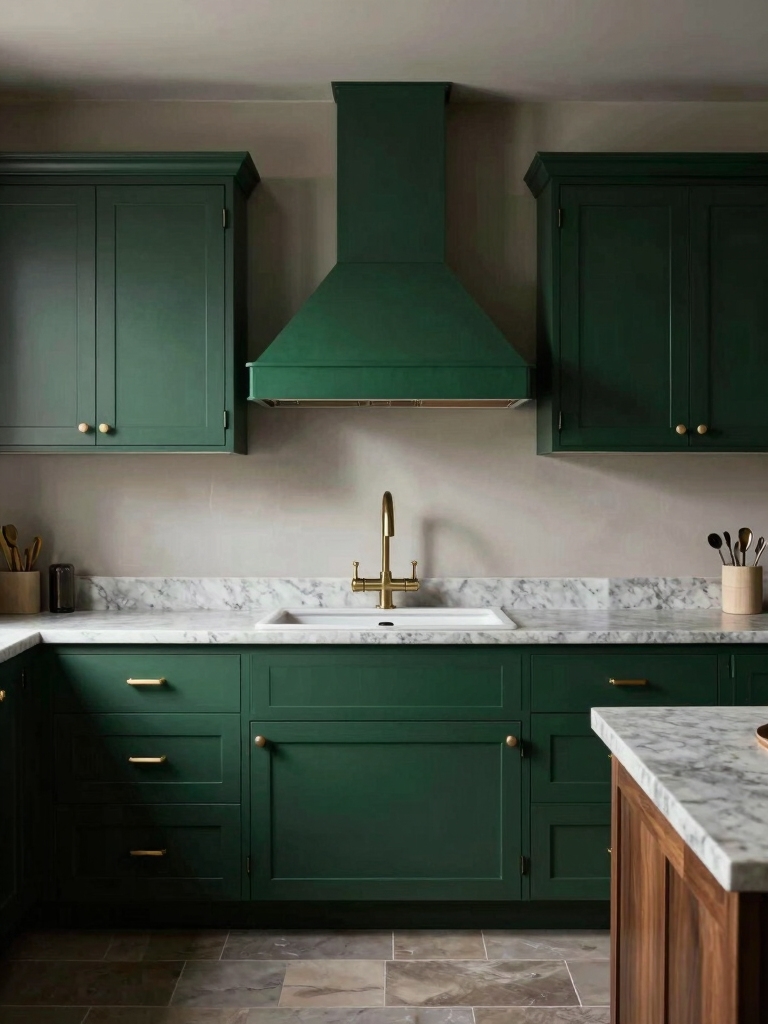
Moody dark green cabinets can offer a similar luxurious vibe that pairs well with navy to deepen a kitchen’s palette.
Pairing With Metals
How do you decide which metals to pair with a navy cabinet? I look at navy’s undertone and room light: warm navies love aged brass or bronze for softness; cooler, blue-steel navies sing with chrome or satin nickel.
I balance contrast and repetition—fixtures, handles, and accents—so the metal rhythm complements cabinetry, creating a cohesive, patterned look that feels intentional and layered.
Designers also often choose paints and finishes based on popular cabinet colors to ensure the navy complements the overall palette.
Pairing Navy Cabinets With Countertops

When I pair navy cabinets with countertops, I love using light marble to create crisp contrast and keep the space feeling airy.
Warm wood tops add a cozy, layered look that plays nicely with navy’s depth.
For a modern punch, I’ll choose bold quartz with dramatic veining to make the cabinets sing.
For white cabinets, the perfect backsplash pairings often include crisp marble to maintain brightness and visual interest.
Light Marble Contrasts
I like to lean into light marble when I pair it with navy cabinets because the stone’s soft veins and luminous surface lift the room without stealing the show.
I favor marble with delicate, directional veining to create a subtle pattern dialogue against rich blue cabinetry. It brightens workspaces, highlights brass or matte fixtures, and keeps the scheme elegant yet lively.
White cabinets are a timeless pairing that consistently complements many countertop choices, including marble, by keeping the overall palette bright and versatile, especially when combined with classic white cabinetry.
Warm Wood Pairing
Warm-wood countertops are my go-to companion for navy cabinets because their grain and tone introduce a tactile, lived-in warmth that softens the cabinetry’s depth.
I love pairing walnut or oak with subtle chevron or plank patterns to echo navy’s solidity.
The result feels layered yet cozy, balancing cool paint with organic movement and rhythm so the kitchen reads intentional, inviting, and still visually alive.
Bold Quartz Selections
A few bold quartz slabs can transform navy cabinets into a striking centerpiece, and I lean into that graphic confidence when choosing countertops.
I favor dramatic veins—gold, white, or charcoal—that play off deep blue while adding texture.
I recommend large-scale patterns to avoid busy seams, pairing matte navy finishes with polished quartz for contrast and a modern, layered look that feels intentional and warm.
Hardware and Finish Options That Complement Navy

Because navy reads as both bold and timeless, I like pairing it with hardware and finishes that either sharpen its edge or soften its depth.
I choose tactile metals and layered textures to create rhythm and subtle contrast without overwhelming the palette.
- Brushed brass for warmth and vintage pattern play
- Satin nickel for modern restraint
- Matte black for graphic continuity
- Aged bronze for layered patina
Balancing Navy With Light and Color

After picking the right hardware and finishes, I think about how light and color will make navy sing in the room.
I balance deep cabinets with crisp whites, soft pastels, and strategic metallic accents to lift weighty blues.
I layer patterned textiles and backsplashes to introduce rhythm, then place lighting to highlight texture and avoid darkness, creating contrast without overwhelming the palette.
Mixing Navy With Wood Tones
I love pairing navy cabinets with warm wood to soften the coolness and add a cozy contrast.
I’ll show how choosing grain-forward pieces—open shelving or butcherblock countertops—keeps the look balanced and tactile.
With a few pattern-conscious choices you can let the wood’s texture sing without overwhelming the navy.
Warm Wood Contrast
Mixing navy cabinets with warm wood tones creates a cozy-contrast that feels both modern and timeless, and I love how the wood softens the navy’s depth without losing its drama.
I pair colors and textures deliberately to keep balance and pattern harmony.
- Honey oak for warmth
- Walnut for richness
- Matte brass accents
- Open shelving for rhythm
Grain-Forward Balance
While navy provides the deep, anchoring backdrop, I lean into wood grain as the patterning that keeps the space lively and layered.
I pair matte navy cabinets with warm oak shelves and textured grain countertops, letting natural veining create rhythm.
That contrast softens formality, guides the eye, and balances cool depth with tactile warmth so kitchens feel curated, cozy, and distinctly intentional.
Using Navy on Islands vs. Full Cabinet Runs
Think of navy as your design’s punctuation: I like to use it on an island when I want a bold, grounded focal point that keeps the rest of the kitchen light and airy, and I choose a full run when I want a more enveloping, sophisticated mood.
I balance scale, pattern, and function to keep things lively.
- Anchor with patterned tile
- Pair with warm wood accents
- Vary hardware finishes
- Keep countertops bright
Lighting Strategies for Dark Cabinets
When you’re working with navy cabinets, I always start by planning layered ambient lighting to keep the room feeling open and balanced.
I recommend adding under-cabinet task lights for clear work surfaces and then finishing with accent and toe-kick LEDs to highlight the cabinetry’s shape and create a subtle glow.
Together those layers make dark cabinets feel intentional, functional, and richly styled.
Layered Ambient Lighting
Because dark cabinets can swallow light, I start layering ambient lighting to create depth and balance without washing out the navy richness.
I mix soft overheads, dimmable pendants, concealed toe-kick glow, and subtle cove washes to sculpt the room and highlight patterns without glare.
- Soft recessed ceiling lights
- Dimmable statement pendants
- Cove or rail washes
- Toe-kick accent strips
Under-Cabinet Task Lights
Across the workplane, under-cabinet task lights give navy cabinetry the practical pop it needs, and I rely on them to keep prep areas bright without fighting the richness of the finish.
I choose slim, warm-toned fixtures that cast even light, highlighting backsplash texture and countertop patterns.
They reduce shadows, make chopping safer, and celebrate navy’s depth while keeping the kitchen inviting and distinctly layered.
Accent and Toe-Kick LEDS
Along the toe-kick and behind open shelving, accent and toe-kick LEDs give navy cabinets a subtle lift that keeps the room from feeling heavy.
I use them to define lines, add ambient warmth, and highlight textures without glare.
- Warm white for cozy contrast
- Dimmer controls for mood
- Continuous strips for sleek lines
- Directional spots for vignettes
Paint Finishes: Matte, Satin, or Gloss for Navy
I often recommend thinking of finish choice as the final note in your navy kitchen’s visual song: matte feels sophisticated and velvety, satin gives a soft, lived-in sheen that hides imperfections, and gloss delivers punchy color and easy cleaning where you need durability.
I favor matte for cozy, layered palettes, satin for balanced kitchens, and gloss when countertops or high-traffic cabinetry demand resilience and vivid contrast.
Integrating Open Shelving and Navy Cabinets
When I pair navy cabinets with open shelving, I think about balance first: the shelves should lift and lighten the deep hue rather than compete with it.
I mix textures and curated objects to keep rhythm, using breathing space to avoid heaviness.
- Light wood for warmth and grain contrast
- White ceramics to punctuate navy
- Brass accents for pattern and sparkle
- Sparse greenery for life and scale
Backsplash Ideas to Offset Navy
To offset navy cabinets, I reach for backsplashes that play up contrast and rhythm so the deep blue can breathe without disappearing.
I pair textured white subway tile, soft marble veining, or geometric encaustic patterns to lift the room. Brass or matte black grout lines add punctuation.
These choices create visual movement, balance navy’s weight, and keep the kitchen feeling layered and lively.
Flooring Choices That Enhance Navy Cabinets
Would you like follow-up paragraphs on specific flooring materials (wood, tile, concrete) and color pairings?
I often recommend floors that balance navy’s depth while adding texture and pattern. I favor contrasts that feel intentional, not fussy.
- Warm wide-plank oak for softness
- Herringbone terrazzo for playful pattern
- Neutral large-format porcelain for calm
- Polished concrete for modern edge
Styling Accessories and Textiles With Navy
I lean into textiles and accessories to soften navy’s intensity and introduce pattern that feels deliberate, not accidental.
I layer striped tea towels, geometric rugs, and floral seat cushions to balance depth with warmth.
Brass hardware and woven baskets add contrast and texture. I choose linens in muted ochre, soft gray, and cream to keep the palette cohesive while letting navy remain the anchor.
Maintenance and Care for Dark Painted Cabinets
Regularly wiping down navy cabinets keeps them looking crisp and prevents grime from dulling the finish.
I gently clean with a mild soap solution, dry immediately, and handle chips quickly to avoid stains.
I also avoid abrasive cleaners and excessive water near seams.
- Use microfiber cloths
- Test cleaners in hidden spots
- Touch up with matching paint
- Keep humidity steady
Budget-Friendly Ways to Introduce Navy Into Your Kitchen
Keeping your navy cabinets looking great with simple care makes it easy to experiment with the color elsewhere in the kitchen.
I suggest small, budget moves: paint an island, swap in navy open shelves, add patterned navy textiles, or use peel-and-stick backsplash tiles.
These focused updates create layered contrast and pattern without a big overhaul, and you’ll see immediate, stylish impact.
I’ve seen how navy can flip a kitchen from flat to fascinating — bold yet calm, dramatic yet comforting — and that’s exactly why I lean into it.
I pair deep cabinets with bright counters, warm hardware, and textured rugs so the room never feels heavy.
You can go luxe or budget-friendly and still get that layered, pattern-forward look. Try one navy element and watch contrast do the heavy lifting while light keeps things easy.